Deadfire Posted October 21, 2016 Share Posted October 21, 2016 I want to make this a mega thread of branding for the organizations in the game to get ideas for their branding. Please do not copy anyone's art fully without the creators permission. I want to make this thread a safe place for people to share there branding with others. (I am very new to the futuristic style of art but I will try my best to post logos and other branding ideas here) Style: futuristic flat, Abused flat, Futuristic vintage - When I think of futuristic I think of flat clean looking art but there are also the places where this style doesn't extend to such as pirates, and aged industry branding. There is an exception though futuristic vintage (like the nukacola logo from fallout) it is a very eye pleasing style of design and is not a bad way to go in this standards. How to chose your style: You will need to do research on what style you like so that you know before you start you won't have to scrap everything because it wasn't a style that fits you, it's all about the artist. If you feel like you like multiple styles try to combine them and/or make sample branding in both styles. I can't tell you how many times I have scraped entire UI folders because in the end the style didn't satisfy me. It all depends on how your eyes react to the colors , shapes , and story. Best places to look at styles in Google or art station. How to chose your colors: Another important factor in branding in your color. When you chose your colors try to go for colors that don't your eyes for most people it is bright white, yellow, and orange try to stay stay from these colors. When using white add some shade of any other color (gray and red) are best. So chose colors comfortable to look at (try not to use the colors that hurt eyes). How to chose your shapes: When you chose your style and color you need to chose/make shapes to combine together to make your branding. There are two types of shapes curved and sharp edged. Use which ever satisfies you. Another factor in shapes in shapes is font. Try to use clean (non cartoon) fonts for your branding as it has a more professional As myself, I will be working on perfecting my skills in making futuristic sharp flat branding/art style. Here is my first attempt at this style and I will be updating this post adding new branding in this style for people to gain inspiration to make their art as best as it can be. As an uninspired artist makes for the worst art. Please tell me what you think and share your branding you made in this thread to give others inspiration If you want me to I will continue to post my advancements in mastering this style. If you would like me to try and make branding for you private message me and I will see what I can make. I want to make this a mega thread of branding for the organizations in the game to get ideas for their branding. Please do not copy anyone's art fully without the creators permission. I want to make this thread a safe place for people to share there branding with others. (I am very new to the futuristic style of art but I will try my best to post logos and other branding ideas here) Style: futuristic flat , Abused flat - When I think of futuristic I think of flat clean looking art but there are also the places where this style doesn't extend to such as pirates , and aged industry branding How to chose your style: You will need to do research on what style you like so that you know before you start you won't have to scrap everything because it wasn't a style that fits you, it's all about the artist. If you feel like you like multiple styles try to combine them and/or make sample branding in both styles. I can't tell you how many times I have scraped entire UI folders because in the end the style didn't satisfy me. It all depends on how your eyes react to the colors , shapes , and story. Best places to look at styles in Google or art station. How to chose your colors: Another important factor in branding in your color. When you chose your colors try to go for colors that do nothing your eyes for most people it is bright white, yellow, and orange try to stay stay from these colors. When using white add some shade of any other color (gray and red) are best. So chose colors comfortable to look at (try not to use the colors that hurt eyes). How to chose your shapes: When you chose your style and color you need to chose/make shapes to combine together to make your branding. There are two types of shapes curved and sharp edged. Use which ever satisfies you. Another factor in shapes in shapes is font. Try to use clean (non cartoon) fonts for your branding as it has a more professional As myself, I will be working on perfecting my skills in making futuristic sharp flat branding/art style. Here is my first attempt at this style and I will be updating this post adding new branding in this style for people to gain inspiration to make their art as best as it can be. As an uninspired artist makes for the worst art. Please tell me what you think and share your branding you made in this thread to give others inspiration If you want me to I will continue to post my advancements in mastering this style. If you would like me to try and make branding for you private message me and I will see what I can make. Latest work: ForlornFoe, Code24, ShinyMagnemite and 1 other 4 Link to comment Share on other sites More sharing options...
ShinyMagnemite Posted October 21, 2016 Share Posted October 21, 2016 Typically I think of sci-fi styles as being clean and very minimal in design... However there are designs within Star Wars that portray a more "used" feel to a highly technological universe.Nice design by the way! Link to comment Share on other sites More sharing options...
Code24 Posted October 21, 2016 Share Posted October 21, 2016 Beautiful logo man! I'm a fan of the flat minimalist look as well. Link to comment Share on other sites More sharing options...
Astralator Posted October 21, 2016 Share Posted October 21, 2016 I really like the futuristic style as well - your logo looks good : ) I designed a construct brand a while back: Deadfire and Underhand Aerial 2 Link to comment Share on other sites More sharing options...
Anasasi Posted October 21, 2016 Share Posted October 21, 2016 I like the idea for a thread and i think your logo is quite swell! However! I prefer a minimalist logo design with a 'used and abused' look to it, I guess texture would be the right term. Link to comment Share on other sites More sharing options...
Deadfire Posted October 21, 2016 Author Share Posted October 21, 2016 - Link to comment Share on other sites More sharing options...
Vyz Ejstu Posted October 21, 2016 Share Posted October 21, 2016 Well I just found someone with my "dead fire" avatar I made my self on the community board "purpleant" how to I report him to a moderator " A wonderful day to you, Deadfire. Before reporting anyone to the moderator, I calmly suggest you discuss the problem with him privately. It may turn out to be trivial: a few laughs or a quick solution is likely to follow. Reporting is to be used whenever it is totally necessary, and not before. Kindly speak to him and satisfy your doubts before you report him. Have a wonderful day. " Hotwingz, ForlornFoe and Cybrex 3 Link to comment Share on other sites More sharing options...
Hyperion_ Posted October 21, 2016 Share Posted October 21, 2016 Basic, pixely, small logo. \/ Down below in my signature Link to comment Share on other sites More sharing options...
Hyperion_ Posted October 21, 2016 Share Posted October 21, 2016 I really like the futuristic style as well - your logo looks good : ) I designed a construct brand a while back: Borderlands? Link to comment Share on other sites More sharing options...
Cybrex Posted October 21, 2016 Share Posted October 21, 2016 I really like the futuristic style as well - your logo looks good : ) I designed a construct brand a while back: Very borderlands esque to me, I like it. Just slight suggestion though, I feel it would look "cleaner" if the bottoms of the "A" merged seamlessly with the circle. Minimalism is becoming the popular with logos/brands these days. I think someone explained it to me like "debranding". Something to do with customers not trusting companies if their logo had a lot of stuff going on with their brand. To be fair though, it does look better. Less is more! Anyways, this was done up by some guys in BOO. Feel free to use for inspiration. Astrophil 1 Link to comment Share on other sites More sharing options...
Astralator Posted October 21, 2016 Share Posted October 21, 2016 Very borderlands esque to me, I like it. Just slight suggestion though, I feel it would look "cleaner" if the bottoms of the "A" merged seamlessly with the circle. Minimalism is becoming the popular with logos/brands these days. I think someone explained it to me like "debranding". Something to do with customers not trusting companies if their logo had a lot of stuff going on with their brand. To be fair though, it does look better. Less is more! Thank you for the feedback : ) I guess I could merge the A with the circle... It would just look even more borderlands-esque then. (And I am not sure if I want that.) Link to comment Share on other sites More sharing options...
Deadfire Posted October 21, 2016 Author Share Posted October 21, 2016 Here is a Basic start of a logo that I thought would be worth showing people so they can gain more ideas Vyz Ejstu and Astrophil 2 Link to comment Share on other sites More sharing options...
Astrophil Posted October 22, 2016 Share Posted October 22, 2016 I always like logos that are very regular and will fit into a perfect circle. It makes for easier formatting especially. I very much like the octagonal one above this post, very well designed. Cinderfall's logo is rather symbolic (perhaps not so much as the Aether's) but keeping to a relatively minimal style at the same time: *Also, @Cybrex I've always found the BOO logo somewhat difficult to see, especially on dark backgrounds - and the honeybadger is virtually invisible. A lighter and more contrasting color scheme would be helpful in visibility. Suggestions for the design team. Kurock 1 Link to comment Share on other sites More sharing options...
Cybrex Posted October 22, 2016 Share Posted October 22, 2016 I always like logos that are very regular and will fit into a perfect circle. It makes for easier formatting especially. I very much like the octagonal one above this post, very well designed. Cinderfall's logo is rather symbolic (perhaps not so much as the Aether's) but keeping to a relatively minimal style at the same time: *Also, @Cybrex I've always found the BOO logo somewhat difficult to see, especially on dark backgrounds - and the honeybadger is virtually invisible. A lighter and more contrasting color scheme would be helpful in visibility. Suggestions for the design team.You're right, ive been meaning to get to it, but eh, we'll get around to it. Link to comment Share on other sites More sharing options...
Deadfire Posted October 25, 2016 Author Share Posted October 25, 2016 Making Improvements!!!! this is a remaster ive been working on for a few days i still need work with the text side but the shapes are more satisfying Astrophil 1 Link to comment Share on other sites More sharing options...
Bernarr Posted October 25, 2016 Share Posted October 25, 2016 Chuckling Casket in all it's splendor. Link to comment Share on other sites More sharing options...
Deadfire Posted April 28, 2017 Author Share Posted April 28, 2017 Chuckling Casket in all it's splendor. Cool cartoonish logo I like it would look grate on pirate type ships Link to comment Share on other sites More sharing options...
Deadfire Posted April 30, 2017 Author Share Posted April 30, 2017 Just finished my remake hope it gives people some ideas Vyz Ejstu 1 Link to comment Share on other sites More sharing options...
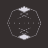
CT3PO0 Posted May 12, 2018 Share Posted May 12, 2018 I am the origional poster for this thread just on a new account here is some concepts for my new corp Imperatoria (AEOTEK and NAVIGON have been abandoned but NAVIGON will be reused as a later project) Link to comment Share on other sites More sharing options...


Recommended Posts
Create an account or sign in to comment
You need to be a member in order to leave a comment
Create an account
Sign up for a new account in our community. It's easy!
Register a new accountSign in
Already have an account? Sign in here.
Sign In Now