I want to make this a mega thread of branding for the organizations in the game to get ideas for
their branding. Please do not copy anyone's art fully without the creators permission. I want to make this thread a safe place for people to share there branding with others.
(I am very new to the futuristic style of art but I will try my best to post logos and other branding ideas here)
Style: futuristic flat , Abused flat
- When I think of futuristic I think of flat clean looking art but there are also the places where this style doesn't extend to such as pirates , and aged industry branding
How to chose your style:
You will need to do research on what style you like so that you know before you start you won't have to scrap everything because it wasn't a style that fits you, it's all about the artist. If you feel like you like multiple styles try to combine them and/or make sample branding in both styles. I can't tell you how many times I have scraped entire UI folders because in the end the style didn't satisfy me. It all depends on how your eyes react to the colors , shapes , and story. Best places to look at styles in Google or art station.
How to chose your colors:
Another important factor in branding in your color. When you chose your colors try to go for colors that do nothing your eyes for most people it is bright white, yellow, and orange try to stay stay from these colors. When using white add some shade of any other color (gray and red) are best. So chose colors comfortable to look at (try not to use the colors that hurt eyes).
How to chose your shapes:
When you chose your style and color you need to chose/make shapes to combine together to make your branding. There are two types of shapes curved and sharp edged. Use which ever satisfies you. Another factor in shapes in shapes is font. Try to use clean (non cartoon) fonts for your branding as it has a more professional
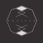
As myself, I will be working on perfecting my skills in making futuristic sharp flat branding/art style. Here is my first attempt at this style and I will be updating this post adding new branding in this style for people to gain inspiration to make their art as best as it can be. As an uninspired artist makes for the worst art.
Please tell me what you think and share your branding you made in this thread to give others inspiration If you want me to I will continue to post my advancements in mastering this style. If you would like me to try and make branding for you private message me and I will see what I can make.
Latest work:


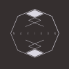 Just finished my remake hope it gives people some ideas